CHIPOTLE
Branding Identity
Identity refresh and branding for Chipotle, a fast casual American restaurant chain that prepares made-to-order bowls, tacos, and burritos in front of its customers.
Chipotle is known for its high-quality food made with fresh, natural, and organic ingredients sourced from local family farms. The goal of rebranding is to create a new visual brand identity to align with their business and resonated with modern customers.
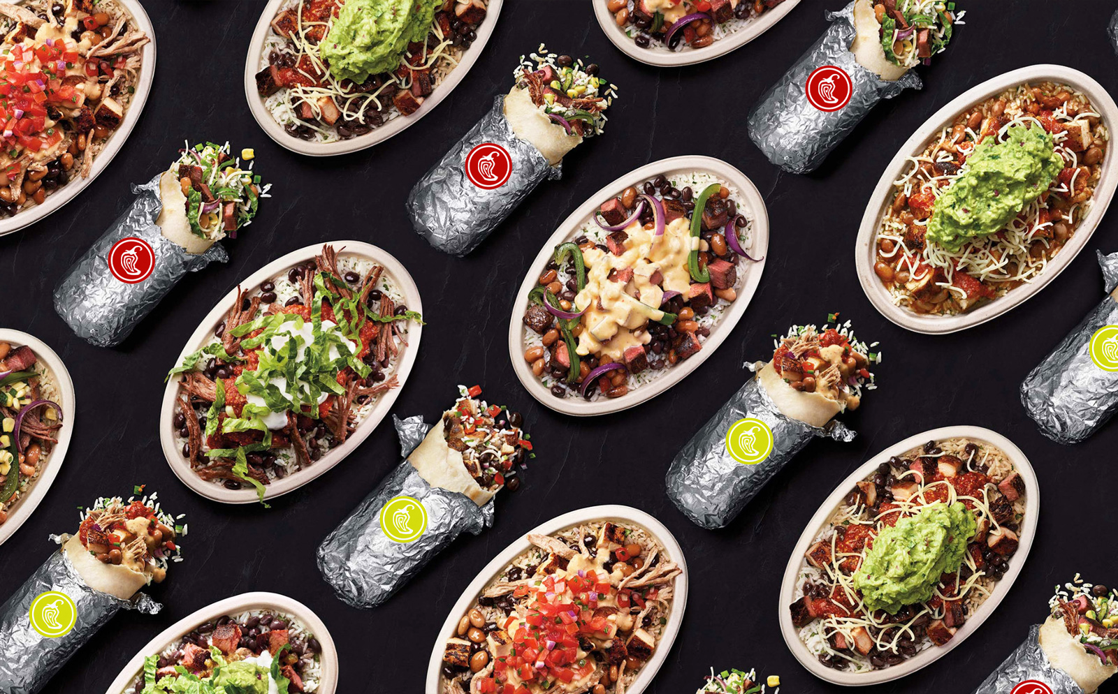
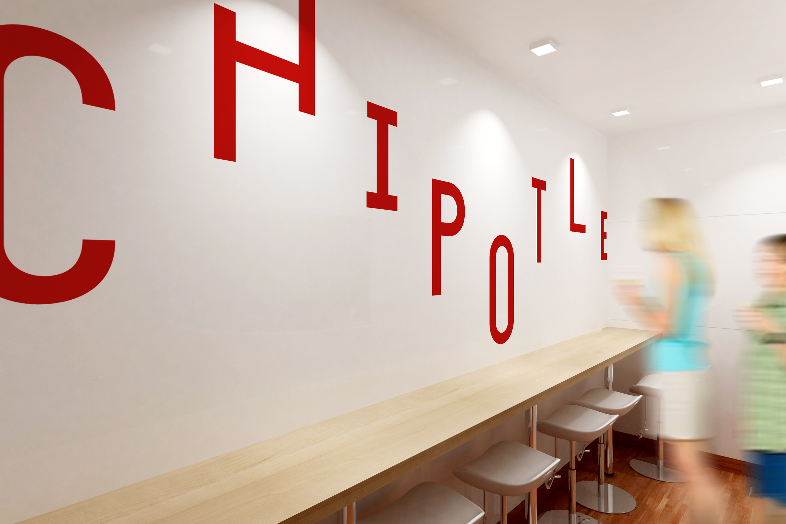
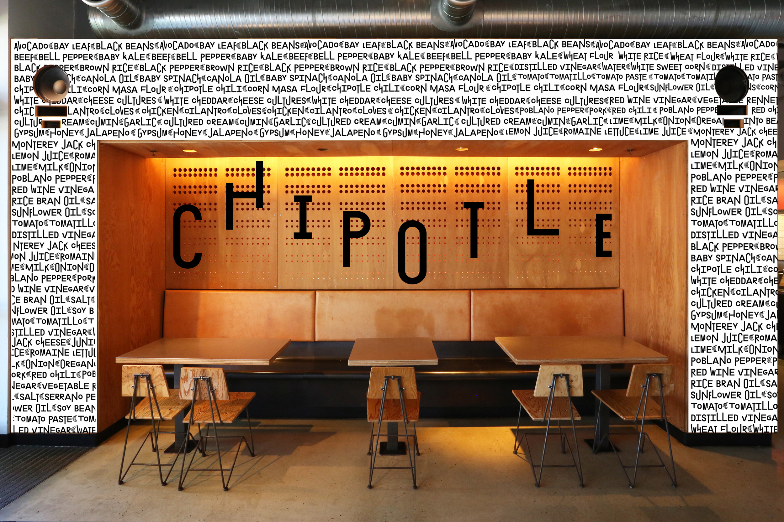
The original Chipotle logo featured the chili pepper after which the restaurant chain was named. The pepper outline symbol has been smoothed, which gives the logo a more contemporary feel. The bold and expressive typography, Exposit, establishes a distinctive look for the new brand identity as it applied across posters and billboards, emphasizing the brand’s flexibility in accommodating custom orders. The color yellow-green has been introduced to the familiar red palette, which brings vibrancy, freshness, intense authentic flavors, and a reliable and trustworthy brand.
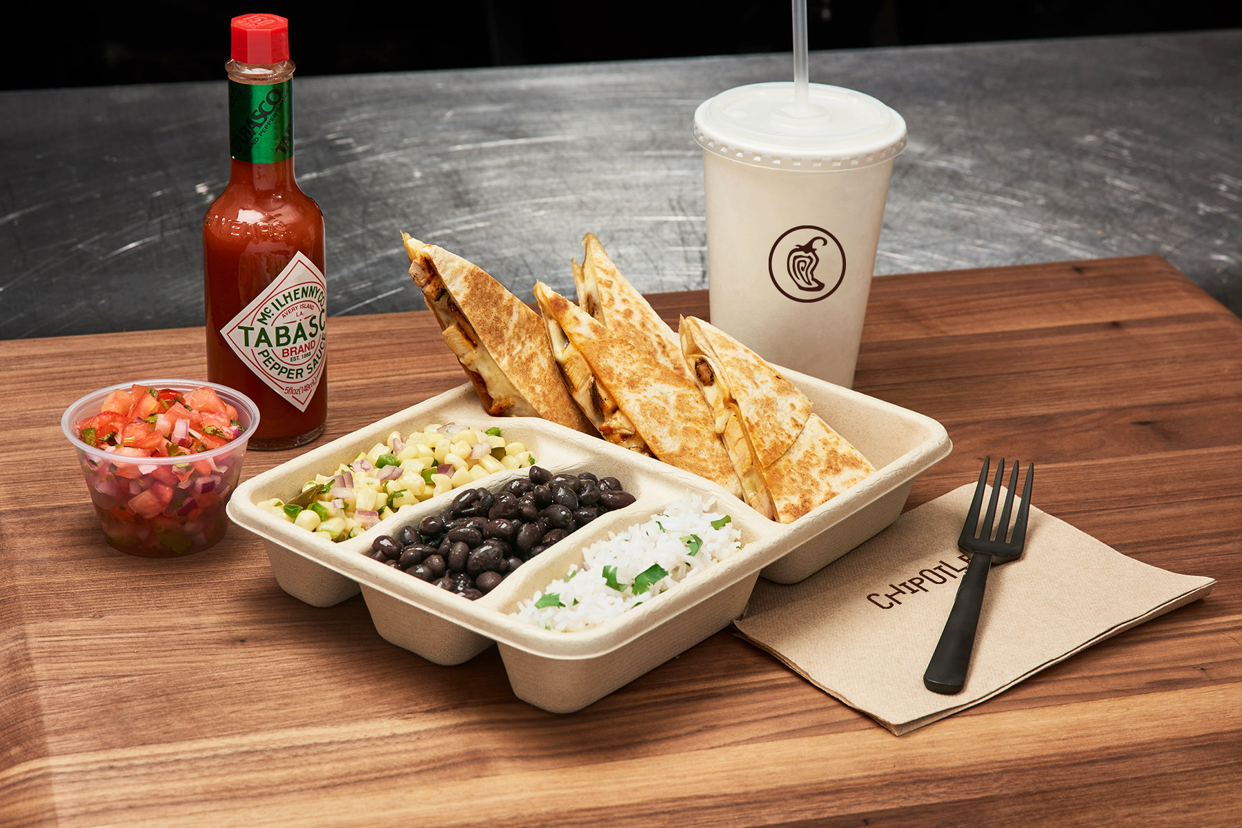
Photography also plays an important role in the brand identity as it showcases clean and close-up images of fresh vegetables, emphasizing the core values of the brand, which are natural food, how the food is raised and prepared, and its tastes.